Brand Clarity
We focused the message on consistency, quality, and customer experience.
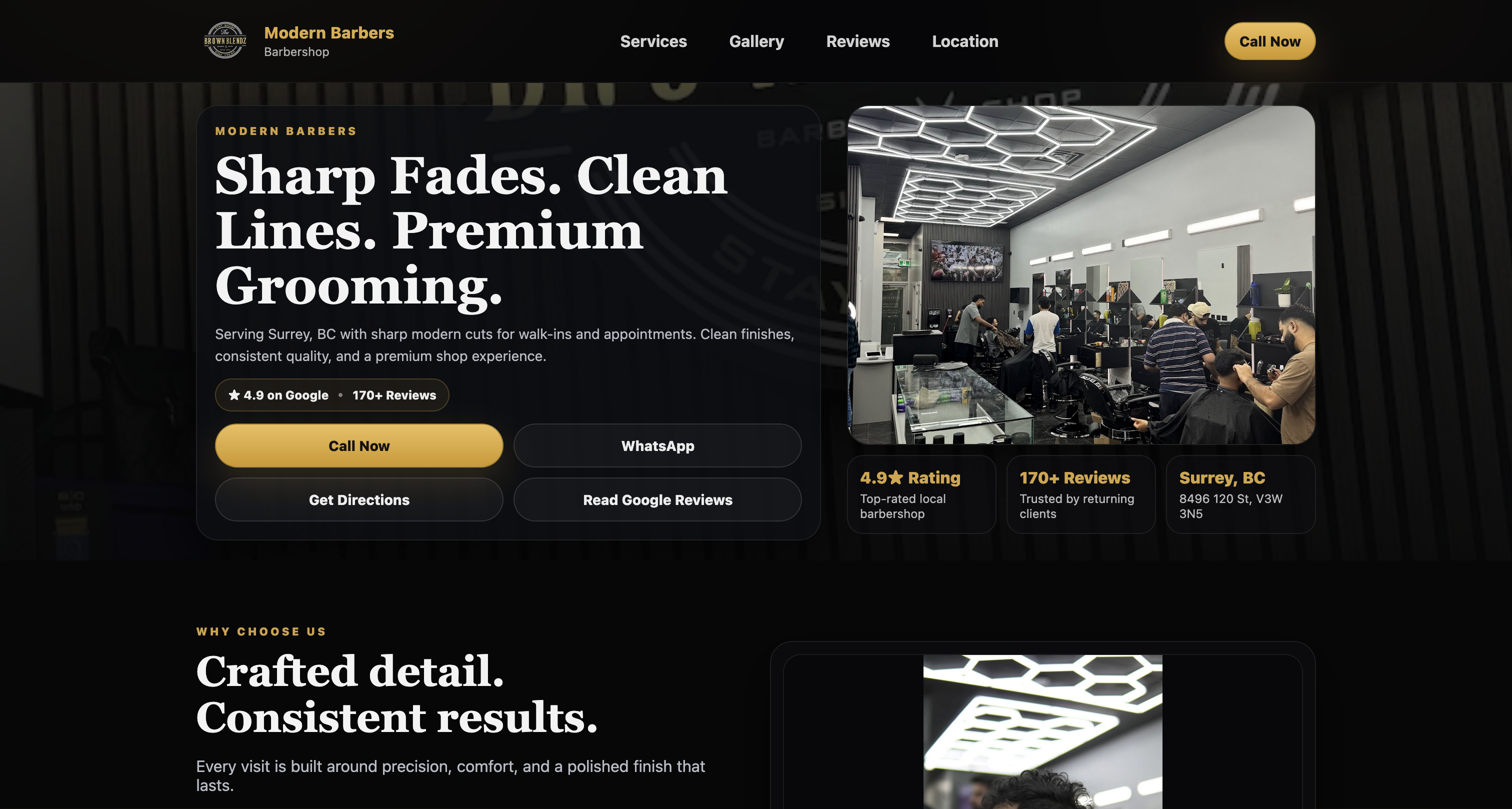
Case Study
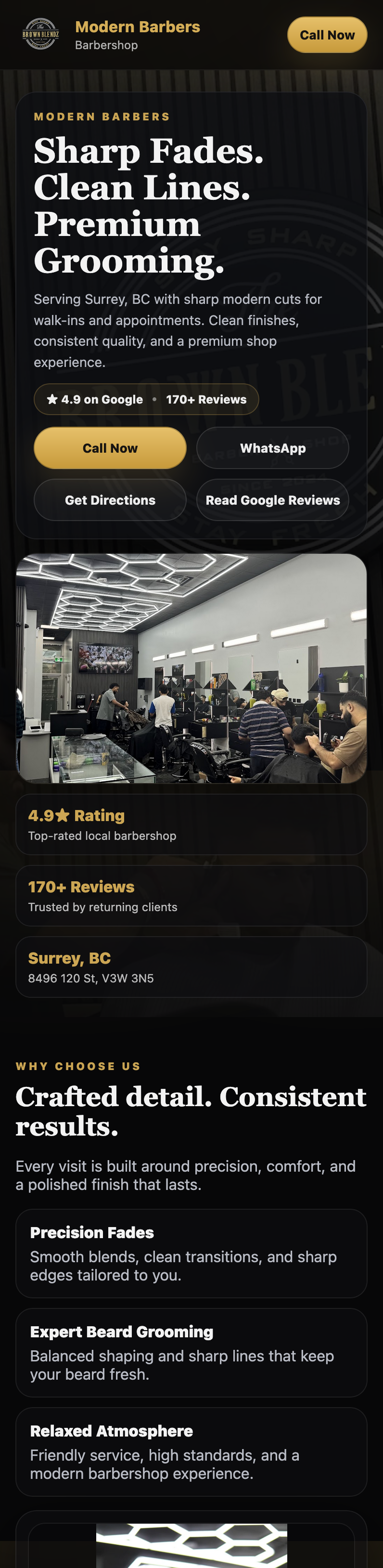
Rebuilding a local brand with clearer service messaging and a cleaner booking-first experience.
The Challenge
The business had strong demand, but the site felt outdated and hard to act on. Service information and credibility were not presented clearly.
Visitors needed a faster path from first impression to booking decision.
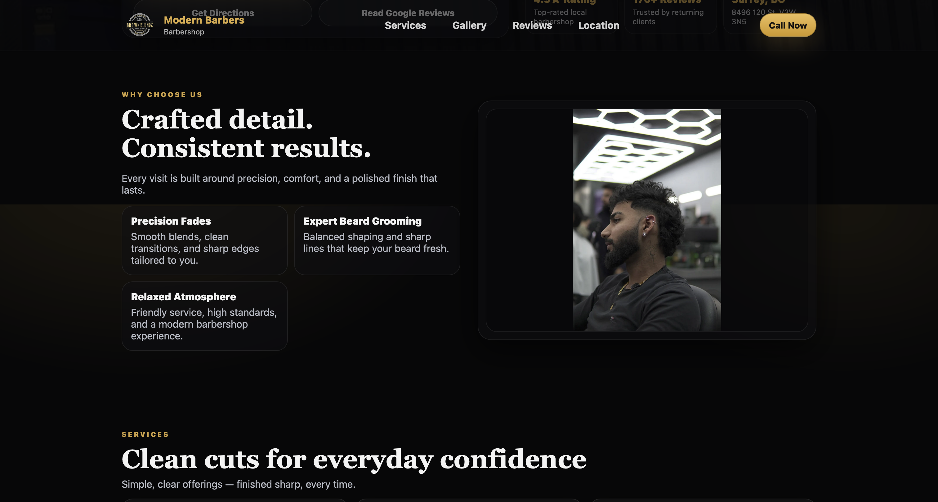
The Strategy
We focused the message on consistency, quality, and customer experience.
We added stronger proof and clearer sections to show professionalism quickly.
We built a direct route to contact and booking with minimal friction.
The Execution
We designed a bold but clean interface that matched the in-shop quality.
We put services, trust cues, and action prompts in a clearer order.
We optimized for mobile browsing and repeat customer behavior.
The Outcome
The new site feels more modern, credible, and easier to use.
Customers can understand services faster and take action without confusion.
Visual Showcase
Need a cleaner site that turns interest into bookings?
Start the Conversation