Brand Clarity
We set a clean, tech-forward tone that felt serious and trustworthy.
Case Study
A marketplace concept designed to feel credible and clear, without falling into the usual noisy gaming look.
The Challenge
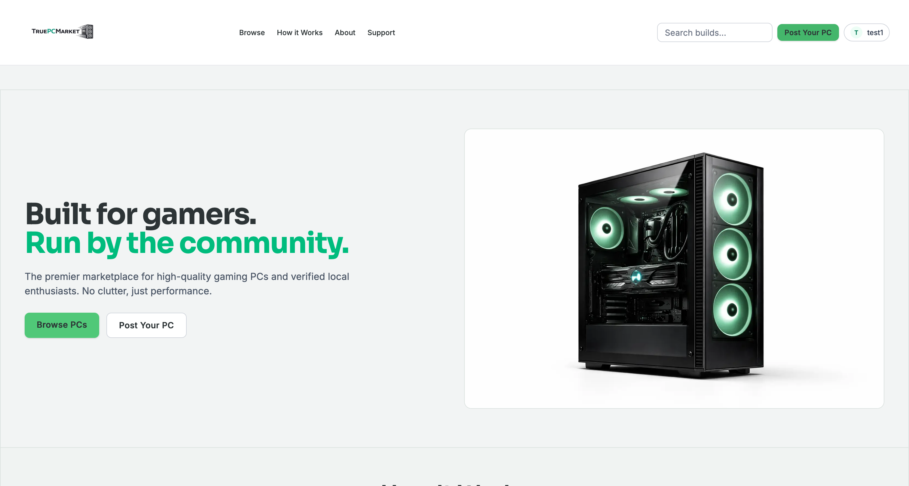
TruePCMarket needed to feel like a serious marketplace from the first screen.
We wanted to avoid the usual loud gamer style that can make a platform feel less trustworthy.
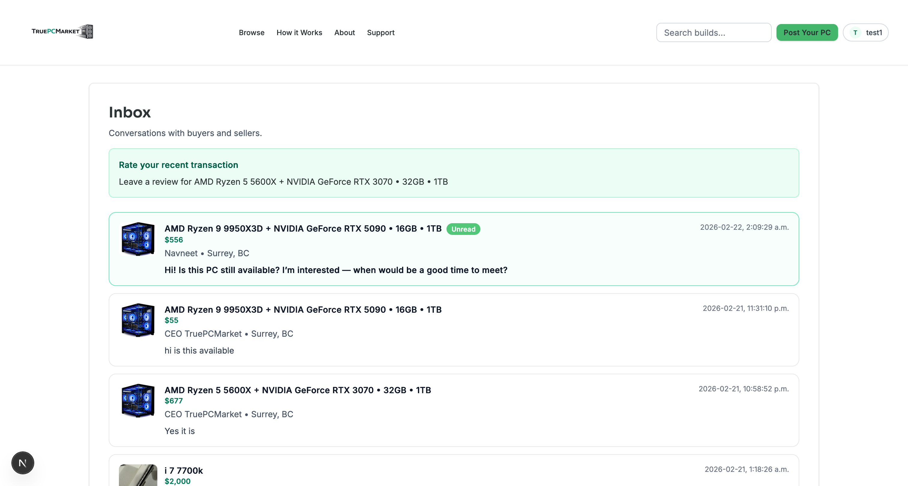
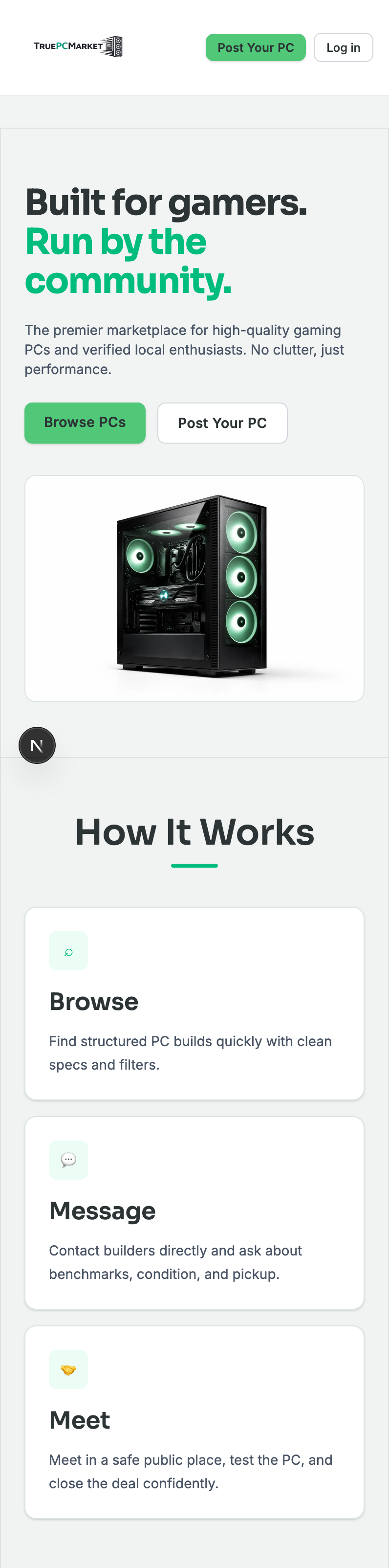
Success meant easier browsing, clearer product structure, and a buying experience that felt dependable.
The Strategy
We set a clean, tech-forward tone that felt serious and trustworthy.
We focused on clear product presentation, plain language, and visual consistency across key pages.
We simplified navigation so users can move from discovery to decision without getting lost.
The Execution
We used clean type hierarchy and restrained accent color so products stay the focus.
We organized page content to show categories, product context, and trust details in a clear order.
We set layout rules for listings and filters so new pages can be added without visual drift.
The Outcome
The concept now has a credible foundation with clear structure and a more trustworthy look.
It is ready to expand into larger listings, filters, and future marketing pages without losing consistency.
Visual Showcase
Next Move
We can help you shape a clean, trusted experience that is ready for real growth.
Start the Conversation